


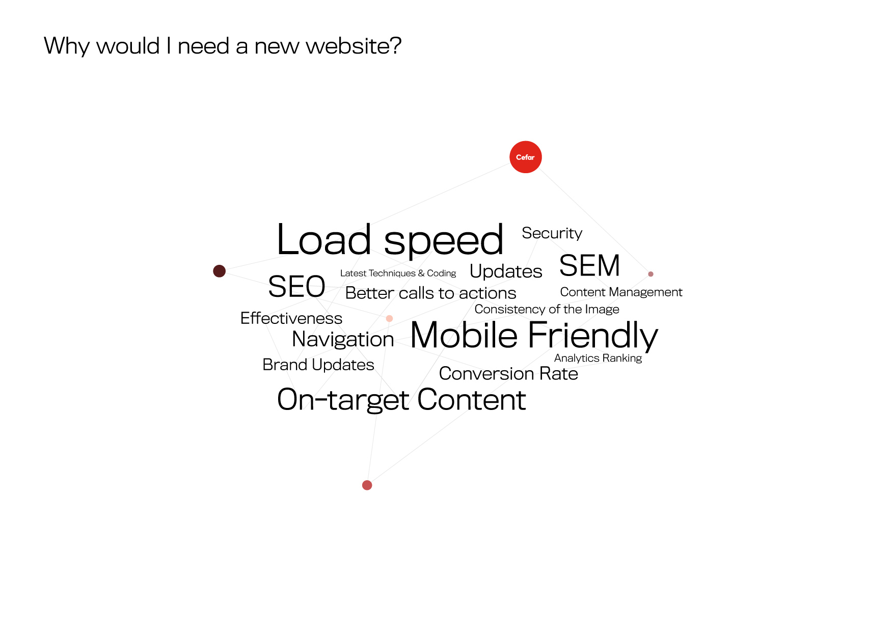
Every well-designed website caters for the needs of its users. And the best way to make a website that caters for users is to have a very clear purpose.
Web designers ensure every site, page, and section they work on has a clear and definitive purpose that it aims to address. This could be anything from providing information and offering entertainment to allowing a type of interaction and completing a transaction.
Crowded and over-designed websites don’t work. When there are too many elements on one page, it only leads to distraction and confusion. Great web design, like this example from Helias Oils, is therefore not only clean and simple but purposeful and built to fit directly in line with what the user wants.
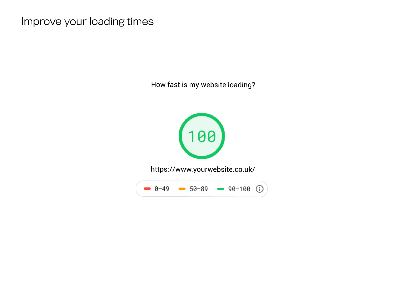
Even if every aspect of your site has a clear purpose, if it takes too long to load, then it’s all but useless to the user.
The problem is, in our culture of little time and an abundance of choice, if a website doesn’t load pretty much instantly, very few users stick around to wait.
Thankfully, to meet these user expectations, there’s no shortage of tools and tricks designers and website owners can use to improve the loading time of their sites.
Some of the best ways to improve page load times include optimising image sizes, combining code into a central CSS or JavaScript file, and minifying HTML, CSS, JavaScript. Improving speed and performance is an experimental and ongoing task, so make sure to track any of your changes using Google PageSpeed Checker. Or for a more detailed review of each individual page use the Experte page speed checker.
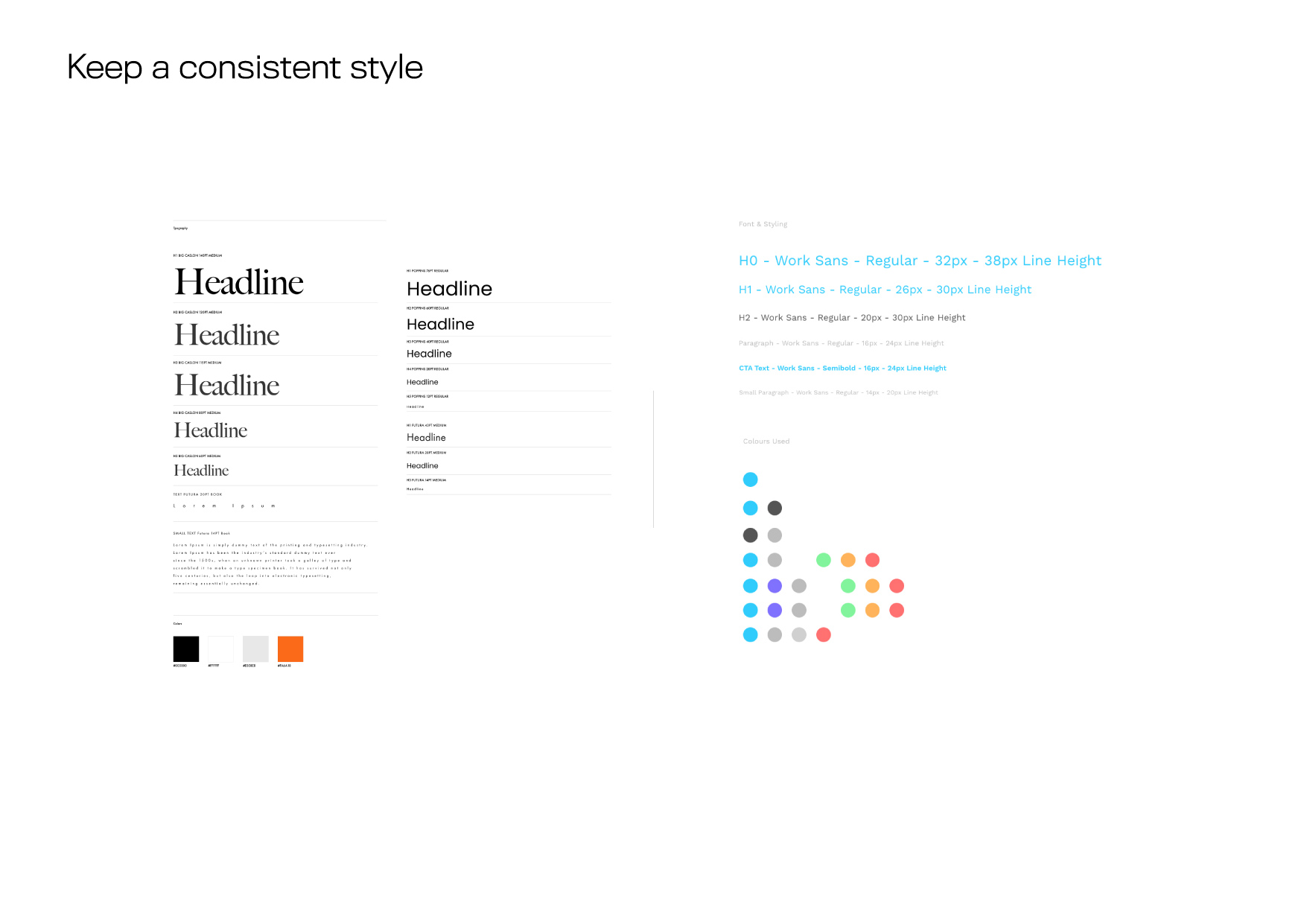
Despite text taking up much of the space of a website and reading being one of the main activities users do online, typography is often overlooked for its impact on the overall success of a website.
If your website gets the basics of typography right, then it is well ahead of most. First, Sans Serif fonts—contemporary looking fonts without decorative finishes—like Arial, Helvetica, and Verdana, are easiest to read online.
The ideal font size is 16px. It’s also recommended to stick to a maximum of three-point sizes for a streamlined design. Similarly, it’s best to use no more than three typefaces across headings, body, and elements like buttons.
An excellent example of a clean and streamlined typography design is Channel 4’s website. The site sticks to just a few font families and colours, and in doing so, keeps the user’s focus directed to the video content for which they are there.
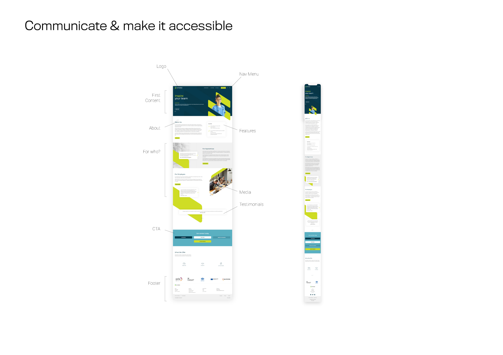
As well as following the basics of typography, an important principle of web design is clear and consistent communication.
Users want information quickly, and so no matter the medium, your message has to be straight forward and easy-to-digest. For instance, for menus and graphical elements, this involves organising information hierarchically, and for content, it means making good use of bullet points and subheadings.
As you can see, improving the communication of your website isn’t always about adding more information. The best websites get across what they need to in as few words and elements as possible.
The website of Headspace, the most popular guided meditation app, is a great example of effective communication. Through using mainly graphics and bold colour, its homepage manages to convey what the app does and who it is for without saying more than a handful of words.
Responsive design used to be optional for effective web design. Today, if your website is not available across multiple devices and multiple screen sizes, it’ll struggle to not only attract users but also rank well in Google.
To make your website mobile-friendly, the easiest place to start is from scratch by rebuilding it with a responsive layout. Otherwise, you can create a dedicated mobile site that is separate from your main site and specifically optimised for mobile users.
With the growing use of smartphones, tablets, and now phablets, making your website fit for mobile users is a must. From there, you can further enhance your design by following best UX and UI practices for mobile design.


